Interested in adding dramatic color to your home but worried about going too far? Rather than dialing down the vibrancy of your favorite bold hue, think instead about using it strategically. An intense color on the wall of a living room or bedroom may be too much, but it can be a fun option for rooms we tend to pass through or spend less time in, such as the powder room.
Photo by Brett Webber Architects, PC

1. Tomato Red
Photo by Martine Paquin Design
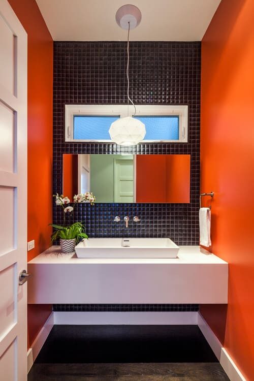
Bold reds are an invigorating choice for wall color in a powder room. Whether you go for a pure red or a modern red-orange, it will provide a high-energy kick. It’s also a flattering shade to surround yourself with since it tends to give people a rosy glow.
By Jennifer Ott Design San Francisco
2. Spicy Orange
Tomato reds work well with medium to dark wood tones and oil-rubbed bronze metal accents. Some crisp white lightens up the palette.
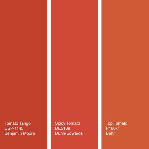
Try these: Tomato Tango from Benjamin Moore, Spicy Tomato from Dunn-Edwards or Top Tomato from Behr.
Photo by Debra Kling Colour Consultant
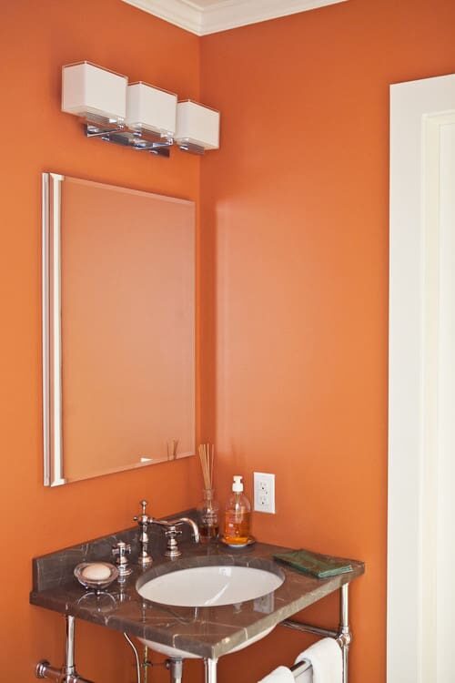
Powder rooms are often cramped and have little wall space for artwork or other accessories. That’s why I love an eye-catching color on the wall, such as a hot orange. It can stand on its own as the only decorative element you need in such a tight space.
Bold oranges play nicely with warm whites or light greys and polished chrome or stainless steel metals.
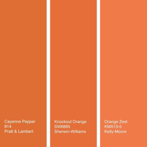
Try these: Cayenne Pepper from Pratt & Lambert, Knockout Orange from Sherwin-Williams or Orange Zest from Kelly-Moore.
By Jennifer Ott Design San Francisco
3. Citrus Yellow
If your bathroom lacks natural light, fake it with a dash of a vivacious yellow. The more neon it is, the less you’ll want to use, but it’s a terrific way to set an optimistic, cheery tone.
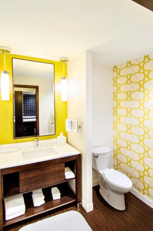
Citrus yellow hues need a good dose of pure white in the room to keep them from being overwhelming.
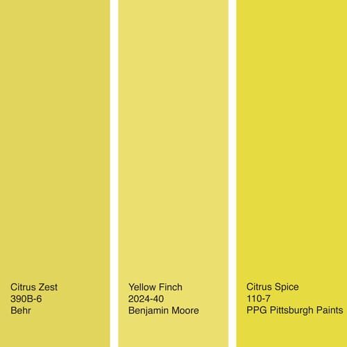
Try these: Citrus Zest from Behr, Yellow Finch from Benjamin Moore or Citrus Spice from PPG Pittsburgh Paints.
By Jennifer Ott Design San Francisco
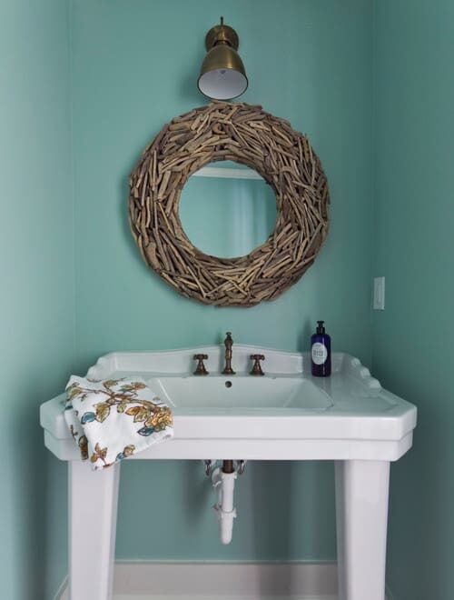
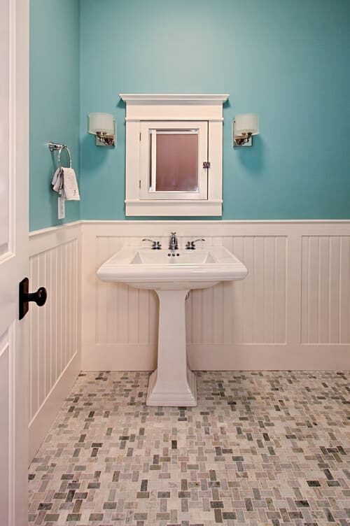
5. Watery Blue
One of my favorite colors for a bathroom is a watery blue because it gives a hit of color that’s still soothing. Look for a shade with a touch of grey if you prefer something darker. The grey tones down the blue for a relaxed vibe.
Photo by Julie Holloway
Here’s another turquoise-clad powder room that exudes a calm, cool and collected feeling. Because cool colors are thought to relieve stress, they’re great if you want your room to evoke a spa-like sanctuary. They also tend to visually recede, making a space seem more expansive than it is.
Photo by Tradition Homes
Watery blues get even beachier when paired with light sandy browns. Go modern with brushed stainless steel finishes or, for a more traditional or transitional look, choose oil-rubbed bronze accents.
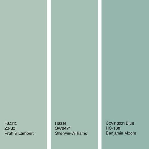
Try these: Pacific from Pratt & Lambert, Hazel from Sherwin-Williams or Covington Blue from Benjamin Moore.
By Jennifer Ott Design San Francisco
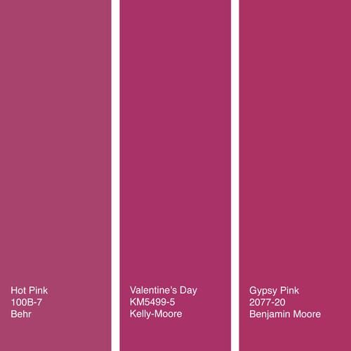
6. Hot Pink
Tough to pull off in large amounts, hot pink can be a striking accent in a powder room. Here, it mixes with black, white and shades of grey for a sophisticated look.
Photo by Armstrong Keyworth
A bit of hot pink goes a long way, so think of giving it a supporting role. If your room gets a lot of natural light, you can use this attention grabber in larger doses.
Try these: Hot Pink from Behr, Valentine’s Day from Kelly-Moore or Gypsy Pink from Benjamin Moore.
By Jennifer Ott Design San Francisco
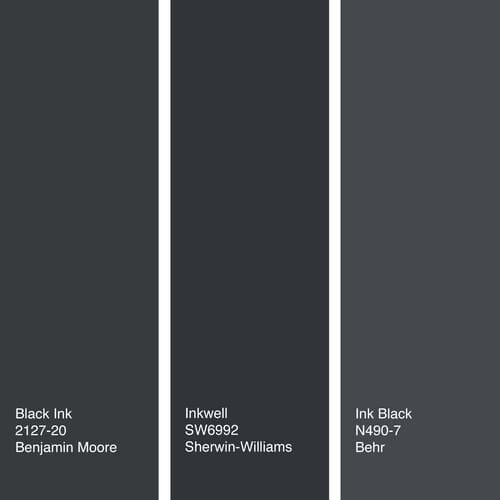
7. Inky Black
Black isn’t so basic when it’s a wall color. And though it’s definitely not a neon hue, it’s still tricky to use indoors in large quantities because it can gobble up the light. So while an all-black living room may be ill-advised, it can be a stunning option in a powder room. It’s especially handsome with bronze or copper metals.
Photo by LUX Design
Sign Up
For Our
Newsletter