
As a national board member for New Zealand’s CCS Disability Action, and now a disability consultant, Stew Sexton knows a thing or two about designing spaces that work for people in wheelchairs. When he and his wife, Doreen, were ready to replace their dated old cottage near the sea, he worked with Lifemark, the independent design certification for homes that use universal design principles, and his architect and builder brothers, Andrew and Richard. They created a home that will work for the couple into their old age — with a style and aplomb that makes it a “poster home” for the five-star Lifemark rating.
HOUZZ AT A GLANCE
Who lives here: Stew Sexton, a disability consultant, and his wife, Doreen, an accountant
Location: Eastbourne, Wellington, New Zealand
House size: 1,938 square feet (180 square meters); two bedrooms, two bathrooms
That’s interesting: The house uses universal design principles to make it accessible to people in wheelchairs.
Stew and Doreen had plenty of time to figure out what was wrong with their old seaside cottage tucked into the side of the hill in Eastbourne. The couple had put up with the old house’s failings for 16 years before spending two or three years plotting and designing with Stew’s brother, architect Andrew Sexton. Another brother, Richard, who now tutors building apprentices, ran the 18-month build.
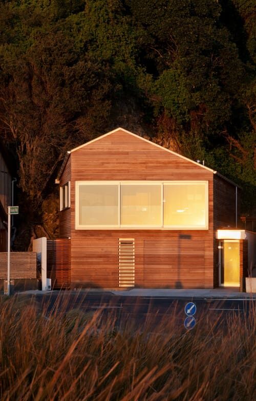
Typical of the area, the 7,750-square-foot site had only about 970 square feet of flat land, right up against the road on one side and a cliff on the other. And while the views were spectacular, the site was often buffeted by Wellington’s legendary winds.
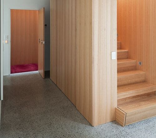
Stew says it was a no-brainer to use Lifemark principles. Andrew had grown up with Stew using a wheelchair, so had an idea of what he needed. First on the list for Stew was internal access from the garage, plenty of turning space for a wheelchair and wide hallways. The entry lobby now leads to the stairway and a water-powered elevator at the end of the hall, the only carpeted space in the house. The house’s odd wedge shape fits snugly into the hill, with space for a ground-floor courtyard and upstairs deck.
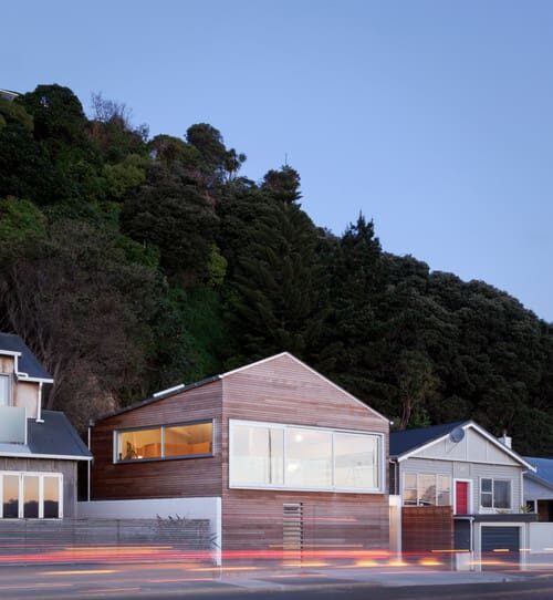
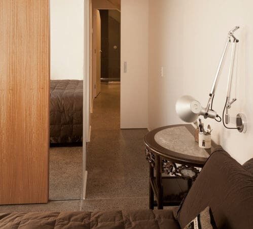
Early on the Sextons agreed to allocate the ground floor to private use — a guest room, with a laundry and bathroom, and the master suite — and make the upper floor for living and work. Wide sliding doors make it easy for Stew to access the rooms.
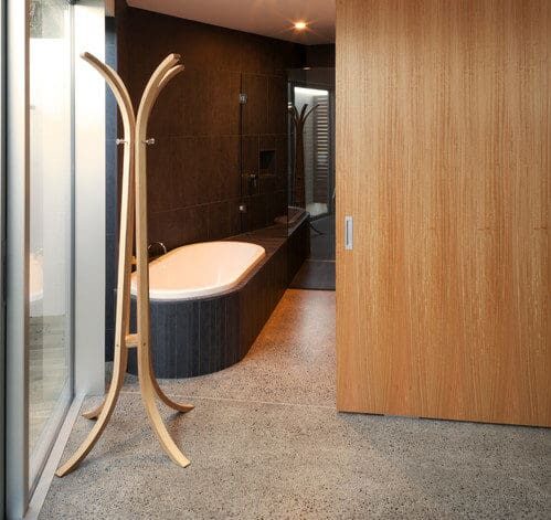
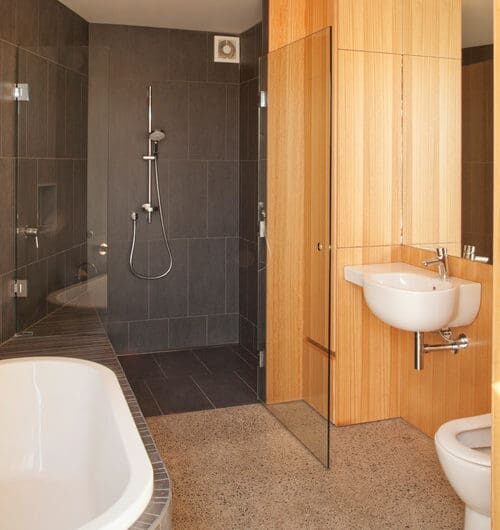
Stew was determined that the bathroom would not look like a hospital but still be easy to use. He opted not to install bars for lifting himself into the shower or onto the toilet, and he specified a regular toilet. However, studs in the walls will allow retrofitting if he requires bars later.
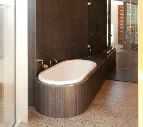
The bath surround, with the look of a luxury spa, is actually a seat that Stew can slide along to get into the shower. There is no lip on the shower floor, and both sink and toilet are regular fixtures that he can reach comfortably from his wheelchair.
Andrew’s design has made the most of odd wedges of space: Glass doors access a tiny drying courtyard, and a wardrobe next door has clothes racks at only about three feet off the ground. Stew is delighted that for the first time he can hang his own clothes.
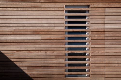
Because the house is close to the road, Andrew used breaks in the horizontal siding to create a shutter over the master bedroom window. The garage door is disguised in the siding too.
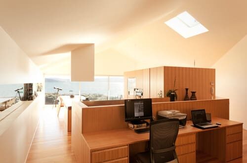
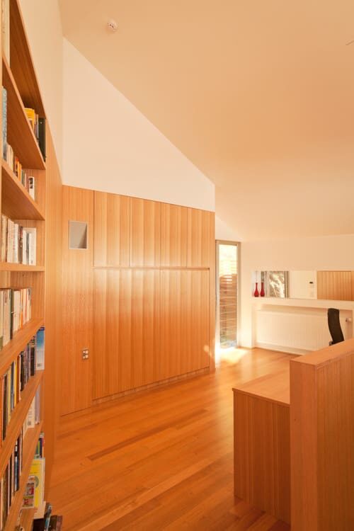
Upstairs, the brothers wanted to make the living area as open as possible to bring in light and to allow Stew easy mobility (no corridors, or doors). Andrew designed a shell in which a wood pod creates the various zones. The tallest part of the pod holds the elevator, the kitchen pantry and fridge, and even a nook for the piano.
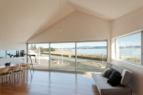
Key to the success of the plan was the wall of glass offering views of the sea and the sunset. Rather than waste space on a little-used deck (those infamous winds), Andrew pushed the living room out with a wall of double-glazed sliding glass. Internal glass balustrades mean the doors can be opened on calm days. A small deck is tucked into the back of the property away from the wind, perfect for Stew’s barbecue and raised beds for the vegetable garden.
Although there is a mass of steel underpinning the open-plan space, Andrew refined the finishes, using a furniture-like Tasmanian ash throughout. Since Stew is a chef by trade and likes baking, he was heavily involved in refining the kitchen design.
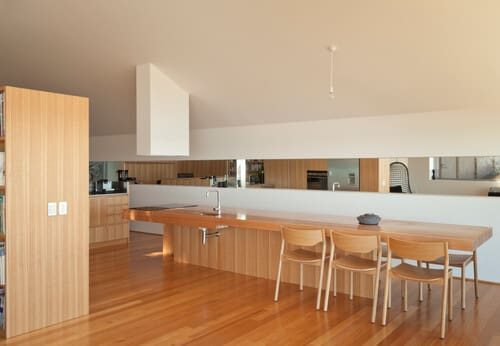
Andrew’s touch is the central island, completely open on one side so Stew’s chair can fit under it, that transitions from work bench to dining table. Cabinets line the back of the island, and the sleek exhaust fan is a sculptural statement. Andrew’s space-expanding trick is a mirror band along the entire southern wall of the room, which bounces views to the back of the space.
The induction stove-top is flush with the counter to make sliding pots on and off easy. Stew says it took some persuading for him to give up his beloved gas range, and he does point out that for people with poor vision, an induction range’s electronic controls are hard to see.
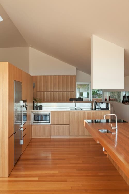
The storage pod has a second sink, a below-counter microwave and sleek stainless steel countertops and backsplash. Stew specified that the cabinets have recessed handles, so there is nothing to catch as he wheels past, and easy-close drawers. The Fisher & Paykel oven has retractable shelving so Stew can safely handle hot trays, and the layout allows Stew and Doreen to cook together.
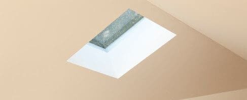
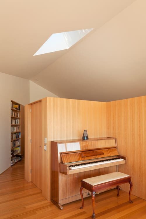
A skylight brings light into the back corner of the kitchen and, just to the left, the piano room.
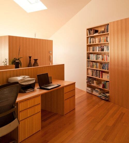
Stew and Doreen both run their businesses from home. A half wall and plenty of built-in storage means they can enjoy the sea views from their side-by-side desks, but not see their work areas from the social end of the room.
The wall of ash makes a feature of the wedge shape where the house meets the cliff. The back-deck door is just to the right of the picture.
Tucked behind the elevator there is even room for a piano.
While he’s always been independent (“If I can’t do something, I’ll find a way to do it”), Stew says the house has made life easier — from being able to get out of the car away from the wind, to having plugs and switches at only 20 inches off the ground so he doesn’t have to struggle to bend over (or fall out of his chair). But these are easier to use for everyone, he points out.
“Not only is the home easier for me to live in, but it also has benefits for others,” he says. “The larger spaces are great for social occasions, and the [counters] and cook-top are a good height for most people too.”
Related Articles
Connect With a Design-Build Firm Like Lifemark
Bungalow Bathroom Gains New Accessibility
Make Your Closet More Accessible With Clothes Racks
As a national board member for New Zealand’s CCS Disability Action, and now a disability consultant, Stew Sexton knows a thing or two about designing spaces that work for people in wheelchairs. When he and his wife, Doreen, were ready to replace their dated old cottage near the sea, he worked with Lifemark, the independent design certification for homes that use universal design principles, and his architect and builder brothers, Andrew and Richard. They created a home that will work for the couple into their old age — with a style and aplomb that makes it a “poster home” for the five-star Lifemark rating.
